Vertical vs horizontal video is not a moral debate. It is a distribution decision. The right format depends on where the viewer is, what they are doing, and how the content will be consumed.
Vertical dominates mobile feeds. Horizontal still matters for YouTube, webinars, explainers, courses, sales demos, and anything where screen detail matters. The mistake is producing one format and pretending it fits everywhere.
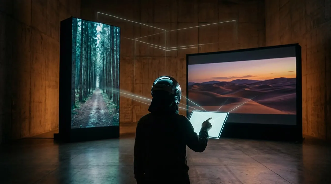
Pick the format for the viewer, not the trend
The lazy version is picking an aspect ratio because it is the one your camera or editor defaults to, then forcing every platform to accept it. That is how you end up with a 16:9 sales demo letterboxed into a tiny strip on a TikTok feed, or a 9:16 phone clip floating between two black bars on a YouTube homepage.
The useful version starts with where the viewer actually is when they hit play. Are they thumbing a feed one-handed on a phone, or leaning back at a desk watching a product walkthrough? That single fact decides the ratio. Once it is settled, AI can help you frame the subject for that surface, generate the right safe-zone composition, write captions sized for the screen it will live on, and spin up a second crop for the other format without re-shooting.
Write the brief before you generate
Before you generate or film a single frame, lock the format decision in writing. The expensive mistake is composing for one ratio and discovering the crop fails on the surface that actually matters. Name the primary home, the ratio, and the safe-zone constraints up front so the framing is right the first time.
- Primary surface: is this living mostly in a phone feed (TikTok, Reels, Shorts, Stories) or on a leaned-back screen (YouTube, webinar, website embed)?
- Aspect ratio: 9:16 for vertical feeds, 16:9 for long-form and embeds, 1:1 or 4:5 only where the placement specifically rewards it.
- Safe zones: where do captions, the subject, and key action need to sit so platform UI never covers them?
- Secondary crop: will this also need a reformat for the other ratio, and what gets re-centered when it does?
Make the first line earn attention
A vertical feed viewer is mid-scroll and a horizontal viewer has already committed, so the same opening cannot serve both. TikTok’s creative guidance tells advertisers to win the hook in the first few seconds, which is why the vertical crop has to land before the thumb moves. And vertical is no longer only short: YouTube Shorts now runs up to three minutes for vertical or square videos, so the phone-first format has to carry the kind of structure horizontal long-form always needed.
In a vertical feed the opening frame and the first caption are the entire pitch, because the thumb is already moving. In a horizontal player the viewer has chosen to watch, so the opening can promise depth instead of shouting. Write the hook for the surface, not as a one-size-fits-all line you paste into both crops.
Write two sets of openers for a video about choosing vertical or horizontal. Set A: 6 hooks for a 9:16 feed clip that land in under 12 words and read clearly with captions only, no sound. Set B: 6 openers for a 16:9 YouTube version that promise a clear answer on which ratio to use and why.Storyboard before you generate scenes
A storyboard is where you commit to the frame, not just the order of shots. Draw each shot inside the actual rectangle you are shipping — a 9:16 box, a 16:9 box, or both side by side — so you can see whether the subject survives the crop before you generate anything. This is the step that catches a cursor or a product label that would fall outside the vertical safe zone.
For a vertical feed cut, keep shots tight and centered: one face or one object filling the frame, captions stacked where no UI overlaps them. For a horizontal version of the same idea, you can spread the composition out — show the screen, the surroundings, the before-and-after side by side — and let the extra width carry context the vertical crop had to drop.
Edit for retention, not decoration

A perfect generation in the wrong ratio still fails. In vertical, the edit has to read on a six-inch screen held at arm's length: bigger text, tighter framing, faster cuts, the point landing before the thumb moves. In horizontal, you can hold a shot longer and let detail breathe, because the viewer chose to sit and watch. Editing a 16:9 demo at vertical-feed pace just feels frantic on a large screen.
The cleanest format test is to preview the export on the device it will actually play on. Open the vertical cut on a phone, the horizontal cut on a desktop or TV. If the captions are unreadable, the subject sits behind the platform's UI, or the framing looks squeezed, the ratio is wrong no matter how clean the source footage was.
Measure versions, not vibes
Assuming one format always wins is not a strategy. Run the same idea as a true vertical cut and a true horizontal cut — not one cropped from the other — and post each to the surface it was built for. Then compare completion rate, saves, and click-through per format, because the same content can outperform vertically on Reels and horizontally on YouTube for entirely different reasons.
The point of producing both ratios is to learn where this kind of content actually earns watch time, not to dump a squeezed crop onto every platform and call it distribution.
The practical rule
Use vertical when the feed is vertical and the decision is fast: TikTok, Reels, Shorts, story placements, mobile-first ads. Use horizontal when the viewer expects depth: YouTube long-form, webinars, product walkthroughs, demos, education, and embedded website videos.
Do not crop one into the other without rethinking composition. Vertical needs bigger text, tighter framing, and faster visual explanation. Horizontal can support more context, screen space, and chaptered explanations.
Aspect-ratio cheat sheet
- 9:16 — TikTok, Reels, Shorts, Stories.
- 16:9 — YouTube long-form, webinars, website embeds, presentations.
- 1:1 — some feed placements and repurposed clips.
- 4:5 — feed-friendly social posts where supported.
How to test the crop before you commit
Do not assume a composition survives reformatting just because the render looks fine in the editor. The only honest test is to view it in the exact frame each platform will impose.
Take one scene and check it across the ratios you ship:
- The 16:9 master, viewed full-width as intended.
- The same scene cropped to 9:16, with platform UI overlaid.
- The same scene cropped to 1:1 for feed and carousel placements.
- A captioned vertical cut viewed on an actual phone.
- A horizontal embed viewed on a desktop hero where it autoplays muted.
For each one, ask whether the export holds up on:
- subject placement inside the safe zone
- caption readability on the smallest screen
- key text, labels, or cursor staying visible
- the framing feeling intentional, not squeezed
- the opening shot making sense before sound
- whether the empty space reads as breathing room or as filler
- whether platform UI ever covers the action
The metric that matters is not "looks good in the timeline." It is "still works after the crop." A stunning horizontal demo that loses its product label the moment it goes vertical is worse for the feed than a plainer scene framed for both from the start.
When one format is not enough
Shipping a single ratio everywhere is usually the mistake. The same idea earns attention differently on a phone feed than on a leaned-back screen, and a crop that flatters one will fight the other.
Producing both formats is not about doubling the work. It is about composing once with both frames in mind, then exporting each crop deliberately instead of letting an auto-crop guess. That is why planning the shot for multiple ratios up front beats reformatting in a panic after publishing: every export looks framed instead of salvaged.
A practical vertical vs horizontal video workflow
Start with one clip and one primary surface. Not a vague “post everywhere.” Decide where this video really lives first, then build for that.
Name the primary home and its ratio, mark the safe zones, and storyboard the shot inside that exact frame. Generate or film only after the framing is locked. Export the primary crop, then deliberately recompose the secondary ratio instead of letting an auto-crop squeeze it. Publish each to its own surface, compare how they perform, and re-cut the weaker crop with better framing.
That is the order that keeps both formats clean:
- Primary surface
- Aspect ratio
- Safe zones
- Storyboard in-frame
- Generation
- Primary crop
- Recompose secondary crop
- Publish per surface
- Measure per format
- Re-frame the weaker crop
Most people fail because they pick a single composition and crop it everywhere afterward. Deciding vertical or horizontal up front, before a single frame exists, is what keeps every export looking intentional instead of squeezed.
The pre-publish format check

Before publishing, check the video against the format it is actually going to live in:
- Does the aspect ratio match where this will be posted (9:16 for feeds, 16:9 for YouTube and embeds)?
- Is the subject, captions, and key action inside the safe zone, clear of platform UI?
- Is the text large enough to read on a phone, not just on a desktop preview?
- If this was cropped from another ratio, does the composition still feel framed rather than squeezed?
- Would a viewer on this specific surface understand the opening shot without sound?
A clean render in the wrong ratio is still the wrong file to ship, so fix the mismatch before posting. AI makes reformatting fast, but a mismatched crop still wastes the impression once it hits the feed.
Plan format before filming or generating
If the final home is TikTok, Reels, Shorts, or Stories, start vertical. Put the subject, captions, and action inside safe zones from the beginning. If the final home is YouTube, a website hero, course content, or a product walkthrough, horizontal may give the viewer more context.
AI makes reformatting easier, but it does not fix bad composition. A horizontal demo cropped into vertical can lose the cursor, product detail, or key text. Decide the primary format first, then create platform variants intentionally.
Producing both formats without doubling the work
Vivideo helps here because you can plan the shot once and produce platform-specific versions from the same job. Start in the agentic AI chat to lay out a storyboard that frames the subject for both a vertical feed and a horizontal embed, use one-prompt generation to spin up quick variants, and drop into manual mode when a crop needs recomposing rather than squeezing. Templates and brand kits keep the look consistent across 9:16 and 16:9, and API/CLI/MCP access lets you batch the format variants instead of re-cutting each one by hand.
Vertical vs horizontal video: plan the crop before production
The worst workflow is filming or generating one composition and hoping it works everywhere. Vertical and horizontal video frame attention differently. A scene that looks balanced on YouTube can feel empty on TikTok. A tight vertical face shot can feel awkward on a website hero.
Plan the crop before production:
- Put critical action near the center when you need multi-format exports.
- Avoid tiny text that disappears on mobile.
- Leave safe zones for captions and platform UI.
- Generate separate compositions for product close-ups when possible.
- Do not rely on automatic cropping for scenes with multiple subjects.
Vertical is usually stronger for phone-first discovery, creator-led clips, social ads, and fast tutorials. Horizontal is stronger for long-form YouTube, webinars, product walkthroughs, courses, and website embeds. Square can still work for feeds, carousels, and paid placements where flexibility matters.
The question is not which format is better. The question is where the viewer will watch and what they need to understand first.
Conclusion
Vertical vs horizontal video is settled by one question: where is the viewer, and what are they doing when they hit play? Vertical wins the phone feed and the fast decision. Horizontal wins the leaned-back screen and the detailed one. AI can produce both crops quickly, but it cannot decide which surface this content was made for.
Use this as your filter: name the primary surface, pick the ratio that fits it, frame the subject inside the safe zone, and recompose the second crop on purpose rather than squeezing it. Get the format right first and every export looks intentional instead of stretched.
If you want one place to storyboard a shot for both ratios, generate the variants, and recompose each crop without re-cutting by hand, you can plan and produce both formats in Vivideo.